SERENE CONTEMPORARY OASIS
Serene, Spa-like Retreat
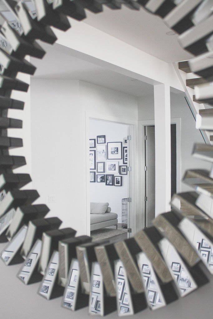
This serene, contemporary oasis of a home is a dream come true for both myself and the client. They wanted a retreat that was contemporary, spacious and beautiful to look at from every angle. Bruce Built Homes did an incredible job in the build of it. I pulled inspiration from many contemporary museums I’ve come across, specifically, the Guggenheim in NYC. I wanted every element in this home to be thoughtful and sculptural in nature. When working with very open and contemporary spaces, you have to make every piece count.
This family consisted of two parents, two children, and a brand new puppy. It seemed as if I had my hands full because in addition, there was the need to seat up to 20+ relatives on any given day. The first order of business was to source a dining table that could seat a minimum of 12. I found this amazing white lacquer extendable dining from Wayfair. It was the perfect mix of form and function with its smooth lines and extendable utility. Because this was the first space seen as you entered the home, we really needed to set the tone. Not wanting to take away from the coffered ceiling, I created three large custom pieces of art with a hint of the home’s accent color. Using balance, scale and a sense of drama, we found the perfect elegant and contemporary note when entering the home.
The two Pantone chairs on each end of the table create a sense of balance and harmony. To counteract the sometimes clinical nature of very modern spaces, we used a more natural fabric for the middle rows of chairs.
A Family Occasion
We played up the contemporary sculptural nature of this home by using a Barcelona and Fortuny inspired daybed and floor lamp.
The strategy for the living room was to create as many opportunities for interaction and conversation as possible. Pieces with either an extremely low or completely open back encourage conversation from every side. This amazing sectional unit from EQ3 set the foundation for the main living area. It was important to go with an armless ottoman on the right end in order to keep the space open and free-flowing. A square ottoman in a slightly darker shade creates functionality and storage for the children. The elegant white leather daybed is a natural yet open divide between the living area and eating nook.
View from the white marble kitchen island.
The baby grand piano on the opposite end of the room adds balance and encourages activity, play, and enjoyment.
A classic black and white gallery wall of family memories next to the piano adds warmth to the room without losing the clean and contemporary feeling.


